The Client
The Intensive Care National Audit & Research Centre (ICNARC) is an independent, not-for-profit scientific organisation which aims to improve the quality of critical care in intensive care units across the country.
ICNARC’s database of research studies is a hugely valuable resource. It was one of the primary sources of information to support the UK response to COVID.
The brief
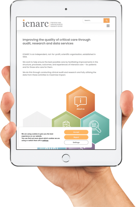
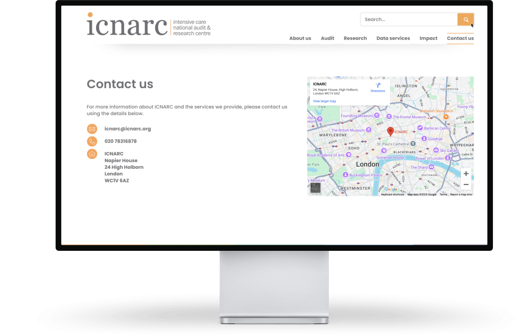
Our client’s website needed an update. They wanted a cleaner look, with simplified navigation and a search function. The ICNARC database is extensive. When users search for specific information, it must be easy to access.
Crucially, the new website had to be simple to update and manage.
Caitlin Wolsey is ICNARC’s Business Development Project Manager.
“On our former website, the content management system made it difficult to upload basic content and file types such as images and video.
We wanted something straightforward so that our staff could update different areas of the site and communicate the right things to the right audiences.”
The website isn’t just an information source for academics. Members of the public also use the ICNARC website, so usability was important.
“We wanted to make the site navigation as user-friendly as possible. This was particularly important in the data services section, because this information must be easily accessed by the public.”
In short, this was a complex website. It required multi-functionality while remaining incredibly easy to use, manage and update.
The process
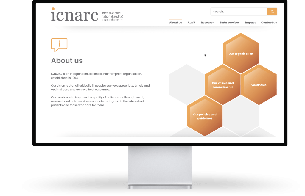
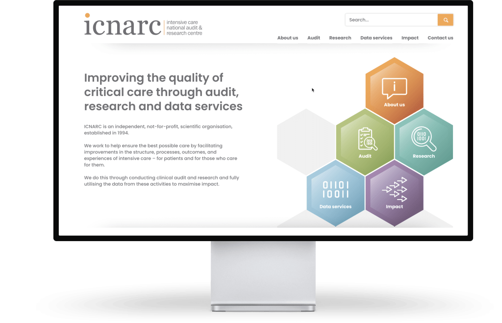
We started with design. For example, we used different colours to make it obvious where you are on the website.
“I love the colours that Pumpkin used. Before, everything was orange. The new colours have had really positive feedback, and we now use them on presentations and slideshows. Those colours have become part of our brand.”
A key part of the brief was using hexagons as navigation points. This was, admittedly, a challenge. However, our developer Gary has a knack for solving impossible problems.
“The hexagons were our vision from day one — but it wasn’t straightforward for Pumpkin. They were great, and came back with options on how to do it.”
To help them manage the site themselves, we uploaded one study to use as a template, and then supported ICNARC as they began to upload more content.
“Neil and Sonya are both lovely. They kept us on track, and were there to answer all our questions. A website project is not always straightforward, and they were great at ensuring we’d considered everything.”
The result
The staff at ICNARC have now started populating the website with research studies.
“The content management system is so much easier. It allows us to have control over different sections of the site, and we can easily upload images and videos. It’s going to make a huge difference.”
It’s an ongoing, supportive relationship. If they get stuck, we’re here to help.
“Pumpkin provided that support throughout, and they’re still providing it now. Everyone at ICNARC likes the new colours, and how concise and streamlined it is. We’ve also had lots of positive feedback from end users. One user described it as `fresh and snazzy’!”
How easy is it to update your own website? Would you like a concise, streamlined (and snazzy) new look? Get in touch with Neil and Sonya on 01489 590092
